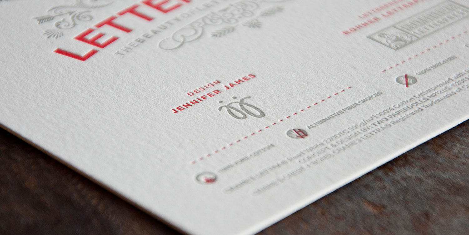
The Beauty of Letterpress is a community resource and online gallery created by Two Paperdolls for Neenah Paper. It was made to educate designers and enthusiasts about the craft of letterpress, as well as raise funds to assist Hamilton Wood Type & Printing Museum with the huge task of relocating to a new studio. The campaign brought together designers and printers to create limited edition letterpress prints, which were sold to raise a total of $30,000 for Hamilton.
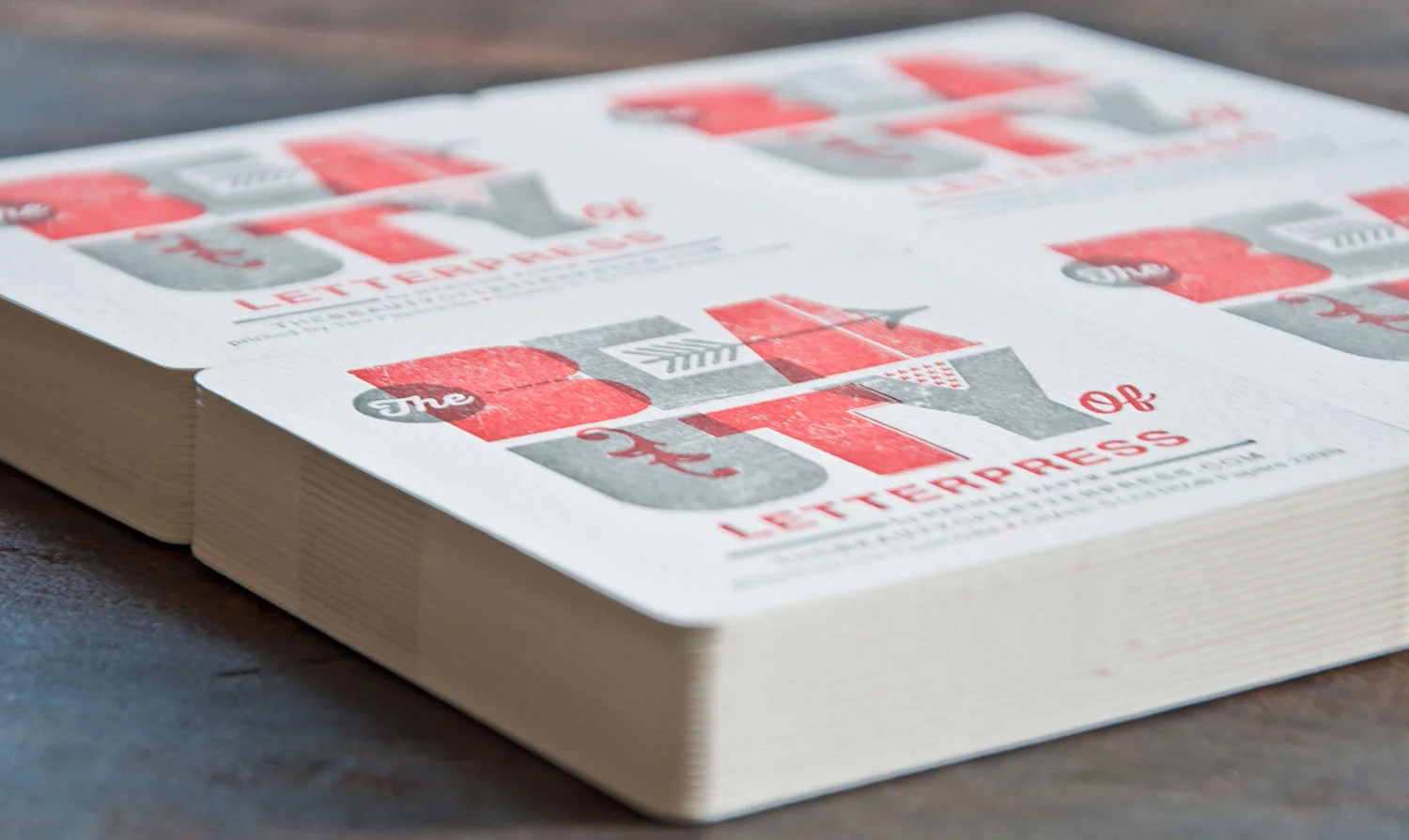
I designed the first print, which also served as branding for the campaign. The coasters were a fun promotional piece I designed to familiarize graphic designers with the basics of designing for letterpress and preparing files for print. The illustrations I made for these also appear on the website.
A bit about the concept behind the logo:
Printers and designers in the letterpress community demonstrate an enormous range of style, and I think it’s really something to celebrate. Despite the advent of magnesium and photopolymer plates, moveable type remains well-loved, influential, and relevant in today’s industry. The first Beauty of Letterpress print gives a not-so-subtle nod to moveable type, but also demonstrates some techniques that would be much more difficult without modern technology. I scanned the back of some wood type to achieve an authentic texture, and adorned the letterforms with ornaments you might find in an “old school” letterpress shop.
Completed at Two Paperdolls.


